Content
Most landing page best practices are built around a simple transaction: someone clicks an ad, lands on a page and takes an action. Keep the copy short, remove distractions, make the button stand out. Easy enough.
But B2B SaaS landing pages don’t work quite like that.
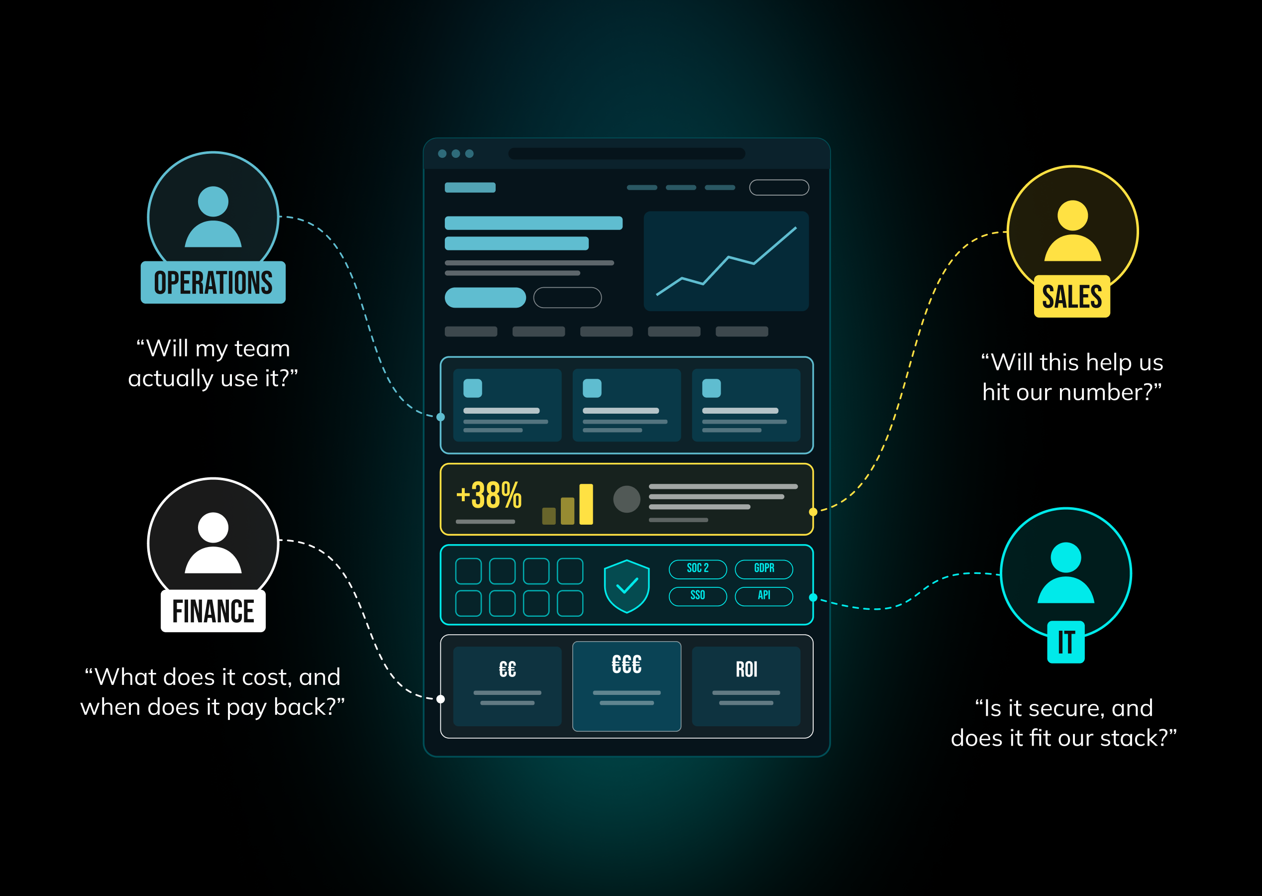
Your visitor might be a Head of Operations researching a problem, a CFO checking the numbers or an IT lead assessing whether your software will work with their existing systems. They might convert today, come back in three weeks or forward the page to someone you’ve never heard of.
If you’ve already followed the usual advice and your conversion rates haven’t moved, the problem might not be your landing page design. It might be what you’re asking the page to accomplish.
TL;DR:
What actually makes a B2B landing page work
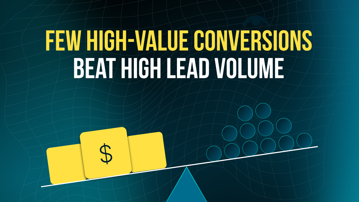
A good B2B SaaS landing page delivers on the promise that brought someone there. It should explain the product clearly and give prospective buyers enough substance to make a convincing case internally. The real measure of success is the quality of opportunities the page generates, rather than its conversion rate alone. And with traffic often too low for meaningful A/B testing, improving performance requires a closer look at what buyers need and what’s getting in their way.
What is a B2B SaaS landing page?
A B2B SaaS landing page is a dedicated page built to turn traffic from an ad, search result, email, or other source into a specific action—usually a demo request, trial sign-up, or content download. A high-converting landing page tells visitors they’ve come to the right place, explains the value of the offer, backs up its claims, and makes the next step clear.
Someone exploring a problem may watch a product walkthrough. Someone comparing shortlisted vendors needs details to make a decision. Counting those actions as equivalent conversions hides an important difference in buying intent.
What makes a B2B SaaS landing page different?
B2B SaaS purchases involve more people, more questions, and more time than the average online sign-up. A visitor might read your page, disappear for three weeks, and send it to someone in finance who has never seen your ad. The content has to survive that trip, especially when the original visitor is trying to build support for a purchase.
Take revenue forecasting software. Sales wants a reliable forecast. RevOps asks about CRM data. IT needs integration details. Finance wants a return on the investment.
According to 6sense’s 2026 research, the average B2B buying group has around 10 people, and 71% start the process with conflicting vendor preferences. That’s a lot of opinions for one landing page to contend with. And while you won’t convince everyone at once, you can at least make life easier for the person trying to get their colleagues on board.
What are the best landing page practices for B2B SaaS?
Start with traffic and message alignment, a concrete product explanation, credible evidence, and a sensible next step. I’d examine these nine areas before spending another afternoon arguing over CTA colours.
- Match your landing page content to what the ad promises. Use the same problem and promise from first click to final CTA.
- Make the hero specific. Tell people what the software does and how it solves their pain points.
- Help the buying group. Answer the questions a champion will hear from colleagues.
- Make proof relevant. Back up each important claim with an example or customer result.
- Ask for the right action. Choose a CTA that fits the visitor’s level of intent.
- Design forms for useful leads. Gather what sales needs without demanding a life story.
- Keep helpful navigation. Let serious buyers check the information that matters.
- Remove technical friction. Check speed, mobile rendering, and form behaviour.
- Track what happens next. Follow submissions through qualification and pipeline.
1. Get the message match right
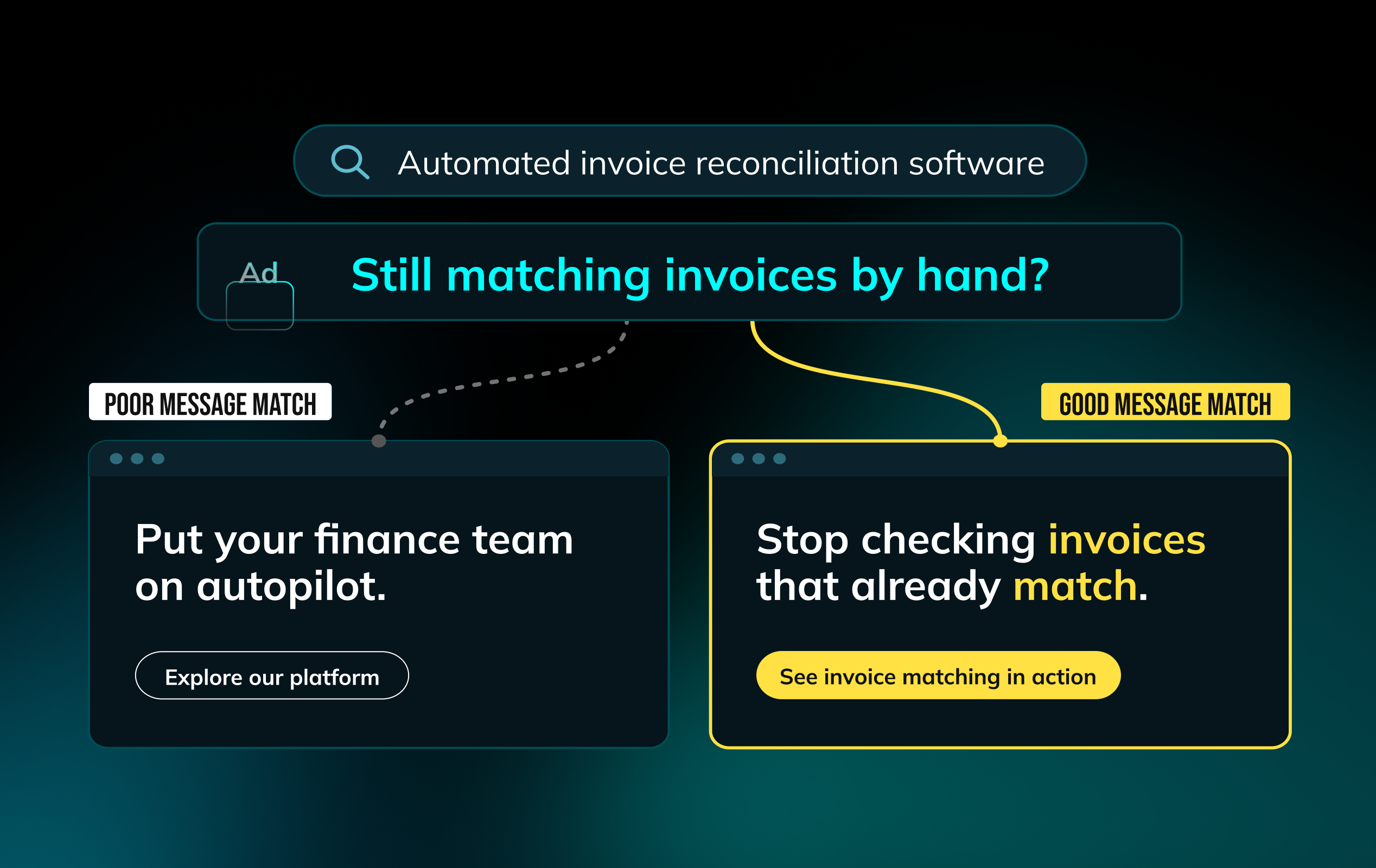
Say someone searches for “automated invoice reconciliation software” and clicks an ad promising fewer manual invoice checks. They arrive to find the headline: “Transform your business with intelligent automation.”
Now they have to figure out whether they’re even looking at the right product.
“Automate invoice reconciliation and catch discrepancies before they reach finance” gets on with the job. The supporting copy can explain the workflow, and the CTA can offer a relevant demo.
Review the keyword or audience, ad, hero, proof, and CTA together. Specific traffic deserves a specific page. If you’re running ads for five distinct use cases, sending everyone to a general platform page may be costing you good prospects. Building that connection is part of effective paid growth.
2. Give the hero a job to do
The hero should speak directly to the problem your customer is trying to solve. Show that you understand what’s frustrating them, explain how your product helps, and make the value immediately clear. A strong headline and supporting copy should do most of that work, alongside a relevant product visual and a CTA that gives visitors a logical next step.
“Unlock the power of intelligent workflows” could be software for almost anything. “Process incoming freight orders automatically, inside your TMS” tells a freight operator which task is being handled and where.
Use the supporting line to explain integrations, manual work, or human oversight. A workflow screenshot can show how the software fits into a real workflow.
3. Give your champion something to take upstairs
Your first visitor may love the product and have no authority to buy it. They’ll need to win over colleagues with tougher questions: “Can we integrate it with our stack?” “Will implementation take months?” “Where does the data go?” “What’s the business case?”
If the landing page offers nothing beyond benefits and a demo button, you’re making the champion do most of that work. A good B2B content marketing strategy makes sure those resources are available and actually answer the questions buyers bring to their colleagues.
Answer the basics on the page, then link to relevant case studies, product videos, guides, or articles for anyone who wants to go deeper. An implementation overview or ROI example can do more than another paragraph about productivity.
4. Use social proof with some substance
Customer logos build trust, especially when the names are recognizable. But they don’t explain what happened after the contract was signed.
Match proof to the claim, like a rollout example for implementation, or measurable before-and-after results for efficiency. A quote about “fantastic collaboration” is pleasant but rarely answers a buyer’s question.
YOYABA’s Xentral case study reports a 62% reduction in cost per sales-qualified account over six months for non-branded search campaigns. It explains how targeting, campaign management, and landing page improvements contributed to the work. That context gives the number meaning.

5. Make the CTA a reasonable next step
A demo is a sensible offer to someone comparing vendors. It can be a big leap for someone who clicked a LinkedIn ad because the problem sounded familiar.
An educational ad might lead to a guide; high-intent search traffic might go straight to a tailored demo.
And tell people what they’re agreeing to. “Book a 20-minute product walkthrough” is clearer than “Get started” if the next screen is a meeting scheduler. A secondary CTA can give early-stage visitors somewhere useful to go.
{{cta}}
6. Design forms for useful leads
You can increase form completions by asking for less information. Whether those extra submissions help sales is another matter.
A gated report may only need an email address. For an enterprise demo, company size or a short question about the use case may help route the lead and prepare a more useful first conversation.
Drop fields nobody uses, and enrich data when it works reliably. Then look at meeting quality as well as completions. Make sure submissions reach the right owner through your CRM and lead routing setup.
7. Let buyers leave the page for a good reason
The advice to remove navigation assumes every departure is a lost conversion. But a buyer clicking through to your security documentation may be making progress.
For a focused webinar signup, a stripped-back page is fine. For a six-figure software purchase, prospects may need integrations, implementation information, pricing, and references before talking to sales.
Keep the CTA obvious and supporting links deliberate.
8. Check the experience on your phone
B2B buyers are discovering brands in more places than ever. LinkedIn remains an important channel, but decision-makers are also scrolling Instagram, watching YouTube, and using TikTok just like everyone else. Your next customer might encounter your ad on their phone, which makes the mobile experience every bit as important as the desktop version.
So open your landing page on your phone and see how it holds up. Does it load quickly? Is the copy easy to read? Can you submit the form without fighting the layout? Heavy videos, shifting elements, and clumsy forms can quickly put people off.
Google’s Core Web Vitals guidance provides useful benchmarks for loading speed, responsiveness, and visual stability, including a Largest Contentful Paint of 2.5 seconds or less.
If slow pages or poor mobile performance keep cropping up, a technical SEO audit can help you identify what’s causing the problems across your site.
9. Follow leads past the thank-you page
Imagine two pages getting 1,000 visits. One generates 80 submissions and two qualified opportunities. The other gets 30 submissions and 10 qualified opportunities.
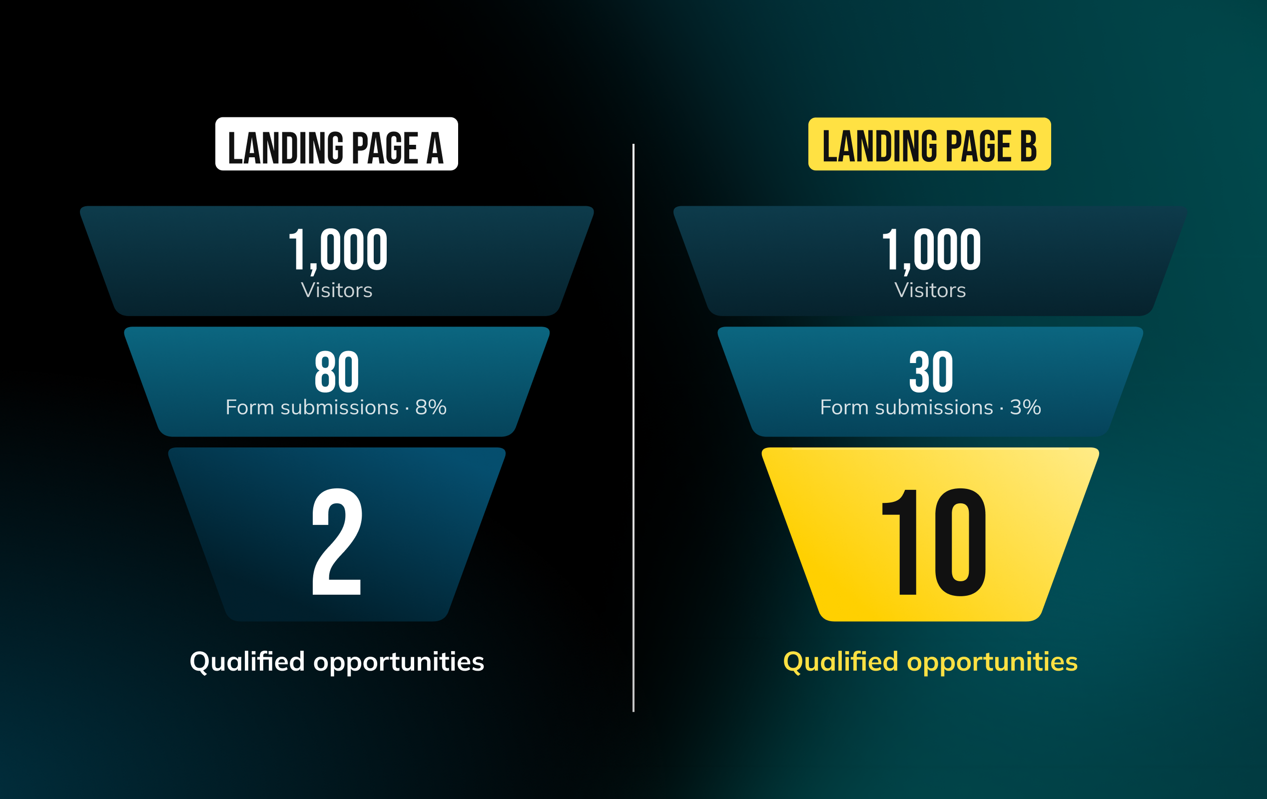
Assuming comparable deal values, the second is delivering more opportunities.
Connect conversion data to CRM outcomes: qualified leads, accepted meetings, opportunities, pipeline, and eventually revenue. Break results down by channel and offer. A cold social campaign and a branded search campaign shouldn’t be judged by the same raw conversion rate.
If things look weak, trace where leads stall in the funnel before rewriting the whole page.
What landing page structure works best for B2B SaaS?
A strong landing page structure follows the questions buyers ask as they evaluate software. First, establish that the offer is relevant. Then explain the product, show credible evidence, address practical concerns, and give the visitor a clear next step. The precise order changes with the product and campaign, but every section should earn its place.
{start-table}
Section
- Hero
- Problem and solution
- Product or workflow
- Customer evidence
- Integrations and implementation
- Business case
- CTA and form
What it needs to do
- Confirm relevance and explain the offer
- Show the problem you solve
- Make the software tangible
- Support claims with results
- Answer adoption and security questions
- Help justify the investment
- Make the next step straightforward
Mainly for
- Initial visitor
- Functional buyer
- End user, Operations
- Champion, management
- IT, Operations
- Finance, economic buyer
- Primary visitor
{end-table}
A single-feature campaign may need only a short page. A platform replacing major infrastructure needs more explanation.
Traffic source matters, too. For paid campaigns, the page should pick up exactly where the ad left off. Pages built for organic search intent may need definitions, comparisons, and related questions. And sometimes an existing product page already does the job perfectly well.
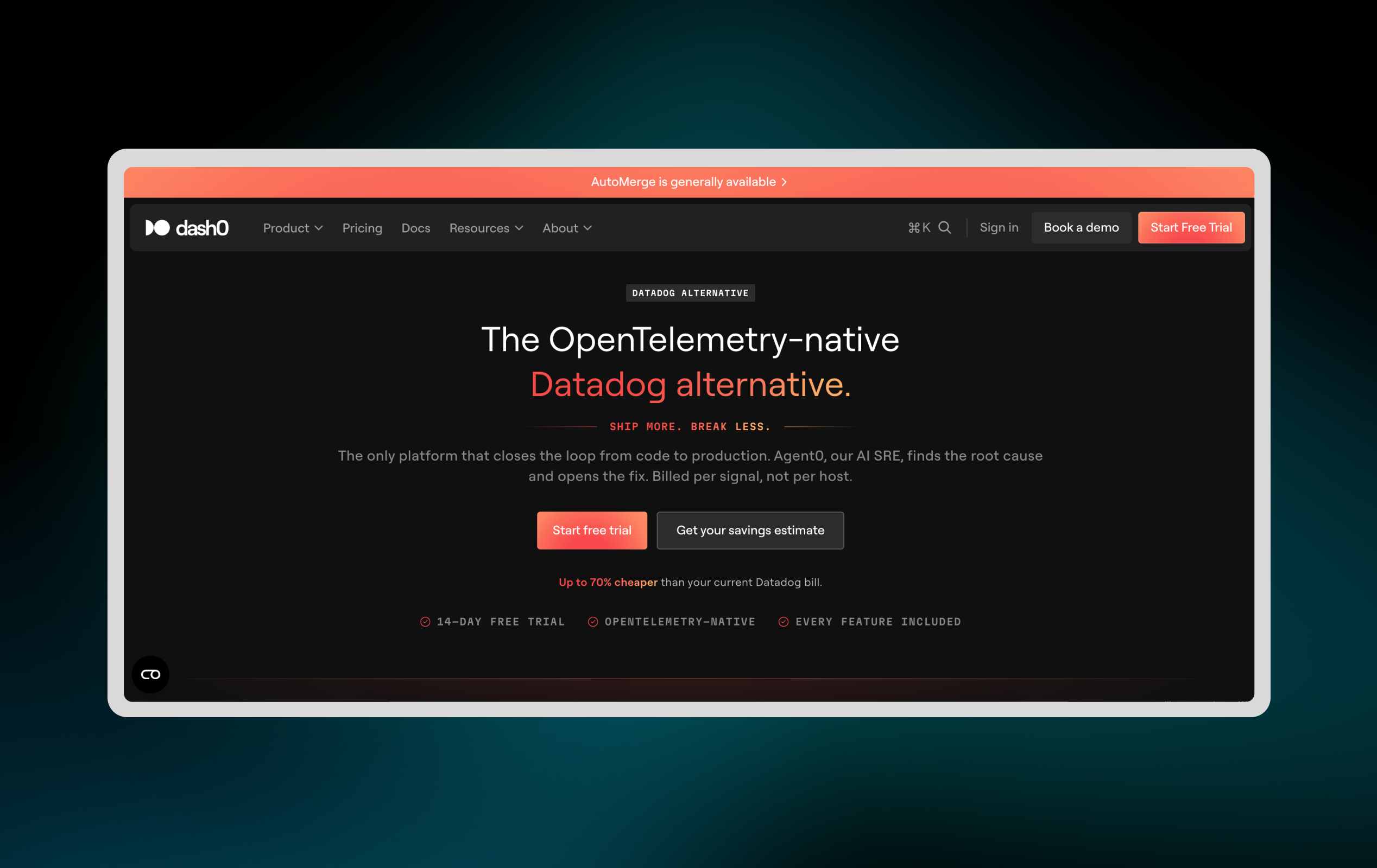
A good example is the Datadog alternative landing page from Dash0, a client we’ve worked with to scale their paid acquisition and pipeline. Someone searching for a Datadog alternative already knows what they’re looking for. They want to see how the two products compare, whether switching makes financial sense, and how much work is involved.
Dash0 gets straight to it. The hero introduces the product as “The OpenTelemetry-native Datadog alternative.” The rest of the page follows through with reasons to switch, a side-by-side feature comparison, pricing differences, and a practical migration guide. Visitors can even request a personalised savings estimate.
It’s a great example of how the original search intent should drive the entire page structure. Someone clicking an ad for a Datadog alternative gets exactly the comparison they’d expect, with enough detail to decide whether switching is worth exploring.
Which popular landing page best practices deserve a second look?
Popular landing page rules are generally sensible in the context they were designed for. The trouble starts when they’re applied to a complex B2B purchase without much thought. Reducing friction matters, but people also need to research, compare, and justify their options. Some of that behaviour looks inconvenient in a conversion dashboard.
{start-table}
Common advice
- “Keep it short”
- “Remove navigation”
- “Minimise form fields”
- “Put everything above the fold”
- “Push every visitor to a demo”
- “Gate the good content”
- “A/B test everything”
When it can get in the way
- The product is complex and buyers need details
- Prospects need security, integration, or pricing information
- Sales needs a few details to qualify the request
- Stakeholders have questions that take more room to answer
- The audience is still exploring the problem
- Buyers need to share material around their company
- There aren’t enough conversions for a useful result
{end-table}
Treat B2B SaaS landing page examples cautiously: a good screenshot won’t reveal the traffic source or lead quality.
The country matters, too. For DACH and wider EMEA campaigns, localisation may involve customer examples, privacy expectations, and buying conventions alongside the language. A translation alone won’t necessarily do the job.
How can you improve a landing page without enough traffic for A/B testing?
You can make sensible improvements to a low-traffic B2B landing page without declaring a winner after every experiment. Start by finding out whether the right people are arriving, what they expected to find, and where they get stuck. Use that evidence to prioritise meaningful changes, then measure lead quality and performance over a reasonable period.
Suppose your page receives 1,000 visits per month and converts at 2%. That’s around 20 conversions. Split the traffic equally for an A/B test and each version gets roughly ten conversions at the baseline rate. A difference of one or two submissions won’t tell you much.
CXL’s A/B testing guide explains why sample size depends on the baseline rate, statistical power, and the size of the change you want to detect. Most modest B2B campaigns simply can’t run dozens of useful tests.
There’s plenty you can do in the meantime:
- Read the search terms and ads. Are people clicking for a specific use case that the landing page barely mentions?
- Ask sales what keeps coming up. If every second discovery call involves the same integration objection, answer it earlier.
- Watch real visitors. Session recordings, usability interviews, and form analytics can show where people hesitate or get confused. They provide clues, not proof.
- Make changes worth making. Fix an unclear promise, weak offer, missing product explanation, or broken mobile form before chasing tiny design variations.
- Check downstream results. Compare qualified opportunities, not just form fills, and note changes in channel mix or campaign spend.
Record your hypotheses and changes. Results may remain ambiguous, especially with long sales cycles, but you’ll learn more from a focused investigation than an underpowered button test.
Lorem ipsum dolor sit amet
Lorem ipsum dolor sit amet, consectetur adipiscing elit. Suspendisse varius enim in eros elementum tristique.
Need help aligning your ads and landing pages?
Learn how YOYABA builds paid media campaigns that attract high-intent B2B buyers and convert them into qualified opportunities.
THe Bottom Line
If your B2B SaaS landing page isn’t delivering, start with the journey that brought people there. Check whether the message fits the traffic, whether buyers can understand and evaluate the product, and whether the next step makes sense. Then follow those conversions into your pipeline. The useful improvements tend to become obvious once you’re looking at the whole journey.
Your questions answered
What makes a good landing page?
A good landing page picks up the visitor’s intent, explains the offer clearly, supports its claims, and makes the next step easy to take. In B2B SaaS, it should also help buyers evaluate the product and discuss it with the people involved in the decision.
What is a good conversion rate for a B2B SaaS landing page?
There’s no single useful figure for every offer. Unbounce’s SaaS landing page benchmark reports a 3.8% median, but combines different conversion actions and SaaS businesses. Compare similar traffic and offers, then look at the quality of leads and opportunities produced.
How many form fields should a B2B landing page have?
Enough to deliver the offer and handle the lead properly. A download may need only an email; a tailored enterprise demo may justify company details and one qualification question. Remove any field whose answer nobody uses.
Should a landing page have navigation?
Keep links that help visitors evaluate the offer. A simple sign-up page may work with almost none; an enterprise product may need easy access to integrations, security documentation, and customer stories. Make the main CTA visible without cutting off useful research.
How long should a landing page be?
As long as the offer requires. A narrow feature or trial page can be brief. A complex platform may need workflow details, evidence, and implementation information. Clear headings and a logical sequence make that material easier to scan.